


这是一个创建于 2772 天前的主题,其中的信息可能已经有所发展或是发生改变。
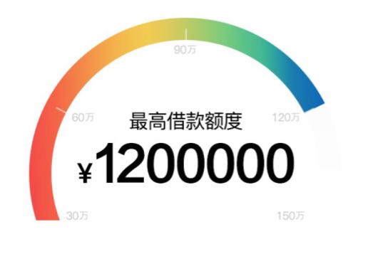
就是根据可贷款的额度,从左到右的有一个动态进度变化,并且颜色逐渐加深。
这个要实现有什么好的方法 /插件呢?
期待大家不吝赐教🙏
第 1 条附言 · 2018-03-21 14:16:45 +08:00
设计师已经给出了效果图了,我是想问如何前端代码上实现这种动态效果。
 |
1
ywgx 2018-03-21 12:17:55 +08:00 via Android
一毛不拔 要好服务?
|
|
2
ywgx 2018-03-21 12:18:31 +08:00 via Android
帖子回复发错了
|
 |
3
Cooky 2018-03-21 12:21:56 +08:00 via Android
变色的地方一个从 255 到 0,一个从 0 到 255 ?
|
 |
4
KayWong 2018-03-21 12:48:06 +08:00
代码还是设计?如果是设计的画正常的设计师随便都能搞出来吧,如果是代码的话,可以让设计师给你一张完整的半圆渐变色图,然后再给你一张白色一样尺寸的图作为遮罩,写代码的时候,白色的盖在渐变色上面,当成一个进度条来做,按照进度旋转白色的遮罩图,这样实现简单
|
 |
5
SakuraKuma 2018-03-21 12:59:33 +08:00
svg.
|
 |
6
pkookp8 2018-03-21 13:07:23 +08:00 via Android
参考画图工具。初始红 255,蓝绿 0.然后增加一个减少一个,反复直到回到红 255 蓝绿 0
|
 |
7
xml123 2018-03-21 13:39:53 +08:00 via Android
HSB 了解一下
|
 |
9
ipuhua OP |
|
10
SakuraKuma 2018-03-21 14:29:58 +08:00
@ipuhua #9 svg 呀,html 不是支持么。lineargradient+path 就可以
|
|
11
ipuhua OP @SakuraKuma 棒~好像确实可以!谢谢❤
|
 |
12
whypool 2018-03-21 14:44:48 +08:00
background: linear-gradient 了解一下
动态加上循环关键帧动画了解一下 |
|
13
ipuhua OP 我找到一个类似的实现思路,给大家参考
www.zhangxinxu.com/wordpress/2015/07/svg-circle-loading/ |
 |
15
rabbbit 2018-03-21 14:55:51 +08:00  3 3
<div class="container">
<div class="out-circle"> <div class="point"> </div> <div class="in-circle"></div> </div> <div class="mask"></div> </div> .out-circle { position:relative; width: 200px; height:200px; border-radius: 50%; overflow: hidden; box-shadow: 0 0 20px 0 rgba(0,0,255,0.1); background-image: linear-gradient(to right, #43e97b 0%, #38f9d7 100%); } .point { width: 400px; height: 400px; position:absolute; left: 50%; bottom: 40%; transform: rotate(50deg); transform-origin: 0 100%; background-color:#fafafa; } .in-circle { position:absolute; width: 70%; height: 70%; top: 15%; left: 15%; background-color:#fff; border-radius: 50%; } #container { position: relative; overflow: hidden; } .mask { position: absolute; width: 100%; height: 100%; background-color: #fff; top: 60%; } |
 |
17
ThomasChan 2018-03-26 14:22:54 +08:00
svg 的话 用 linearGradient 和 clipPath 实现
```html <svg width="245" height="120" style="position: absolute;"> <defs> <linearGradient id="MyGradient" x1="0%" y1="0%" x2="0%" y2="100%"> <stop offset="0%" stop-color="#835FFF"></stop> <stop offset="50%" stop-color="#4C74FF"></stop> <stop offset="100%" stop-color="#2783FF"></stop> </linearGradient> <clipPath id="MyClipPath"> <path d="M3.552713678800501e-15,-98.5900603509299A9,9,0,0,1,9.818181818181822,-107.55279311010534A108,108,0,0,1,86.77852619712375,64.29220319024A9,9,0,0,1,73.55407079147611,65.64905688585722L73.55407079147611,65.64905688585722A9,9,0,0,1,72.31543849760311,53.576835991866666A90,90,0,0,0,8.18181818181818,-89.62732759175445A9,9,0,0,1,3.552713678800501e-15,-98.5900603509299Z"></path> </clipPath> </defs> <g transform="translate(122.5, 105.6) rotate(-90)"> <path d="M3.552713678800501e-15,-98.5900603509299A9,9,0,0,1,9.818181818181822,-107.55279311010534A108,108,0,0,1,9.818181818181815,107.55279311010536A9,9,0,0,1,3.552713678800501e-15,98.5900603509299L3.552713678800501e-15,98.5900603509299A9,9,0,0,1,8.181818181818185,89.62732759175447A90,90,0,0,0,8.18181818181818,-89.62732759175445A9,9,0,0,1,3.552713678800501e-15,-98.5900603509299Z" stroke="none" fill="#EBF4F7"></path> <path d="M3.552713678800501e-15,-98.5900603509299A9,9,0,0,1,9.818181818181822,-107.55279311010534A108,108,0,0,1,9.818181818181815,107.55279311010536A9,9,0,0,1,3.552713678800501e-15,98.5900603509299L3.552713678800501e-15,98.5900603509299A9,9,0,0,1,8.181818181818185,89.62732759175447A90,90,0,0,0,8.18181818181818,-89.62732759175445A9,9,0,0,1,3.552713678800501e-15,-98.5900603509299Z" stroke="none" fill="url(#MyGradient)" clip-path="url(#MyClipPath)"></path> </g> </svg> ``` |
 |
18
qwertyegg 2018-04-01 09:35:53 +08:00
wasm 做这个很合适
|
 Select Language